Importance of Mobile Phone Icons in User Interface Design
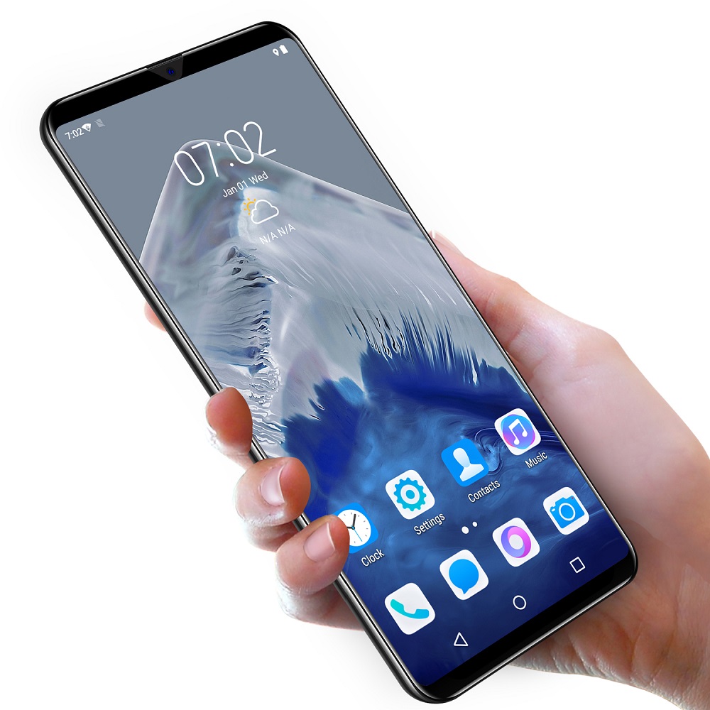
Mobile phone icons are vital in user interface (UI) design. They guide users through the app with ease and clarity. These small graphics hold great power in enhancing user experience. By providing visual cues, they help users navigate their devices more intuitively. An effective icon must be instantly recognizable, indicating its function without words. This visual language bridges language barriers, making apps more accessible to a global audience.
Well-designed mobile phone icons contribute to the app’s overall aesthetic. They reflect the app’s identity and can even influence brand perception. In cluttered app interfaces, a distinctive icon can grab attention quickly. It’s not just about looking good; it’s practical, too. They streamline the design, reduce text clutter, and make for a cleaner interface.
Furthermore, consistency in icon design ensures a cohesive look and feel across the mobile app. Users can transfer their understanding of one icon’s purpose to another with similar design cues. This consistency also helps with brand recognition, as users begin to associate certain icon styles with your app.
In conclusion, mobile phone icons are key to creating an intuitive, attractive, and cohesive user interface. They help users navigate your app, contribute to its visual appeal, and support your branding efforts. Crafting the perfect mobile phone icon, therefore, is an integral part of mobile app design.
Key Elements of a Memorable Mobile Phone Icon
To craft an icon that resonates with users and stands the test of time, it’s crucial to focus on several key elements. Making a memorable mobile phone icon involves design considerations that span aesthetics and functionality. Let’s delve into these essential components that every app designer should keep in mind.
- Clarity: A mobile phone icon must convey its purpose clearly. Users should understand its function at first glance. Ambiguity can lead to confusion and a poor user experience.
- Recognizability: The icon should be distinctive. It must set itself apart from other app icons and be easily identifiable even outside the context of the app.
- Consistency: The styling, coloring, and sizing of mobile phone icons need to be consistent. This consistency helps users associate these icons with the app and learn how to navigate it more quickly.
- Scalability: Your icon should look good at any size. From large tablets to smaller smartphones, the design must be scalable without losing quality.
- Versatility: A good mobile phone icon works well on various backgrounds and within different design layouts. It should maintain its integrity in both light and dark modes.
- Cultural Sensitivity: Icons are seen by a global audience. Designers must consider cultural differences to ensure icons are appropriate and understandable for all users.
Mastering these key elements will help you create a mobile phone icon that not only looks appealing but also enhances the usability of your app.
Color and Contrast: Making Your Icon Stand Out
In the world of mobile phone icons, color and contrast play pivotal roles. They make icons pop off the screen, catching the user’s eye. To make your icon stand out, you must choose colors wisely. Pair bright colors with neutrals to create a bold contrast. This technique draws attention while maintaining a professional look.
Consider the psychology of color when selecting hues for your icon. For instance, blue can evoke trust, while red may signal urgency or excitement. Use color to reflect the icon’s purpose or the app’s brand. But remember, too many colors can overwhelm the user. Stick to a limited palette for clarity and impact.
Contrast ensures your icon’s visibility. A high contrast between the icon and the background is key. It helps those with visual impairments or those using their devices in bright sunlight. Test your icon on various backgrounds to guarantee it stands out in every setting.
Be mindful of color blindness by avoiding problematic color combinations. Tools are available to simulate how your designs appear to users with color vision deficiencies. Ensuring accessibility for everyone is not just inclusive; it’s good design practice.
In short, thoughtful use of color and robust contrast can elevate your mobile phone icon from good to great. It’s not just about being eye-catching – it’s about being functional and sensitive to all users.
Size and Scaling: Ensuring Visibility Across Devices
Size and scaling are critical for mobile phone icon visibility. An icon must be clear on all devices, from large tablets to smaller phones. Here’s how to achieve this:
- First, design with a vector format. This ensures your icon resizes without losing quality.
- Next, test your icon on multiple screens. Make sure it’s legible and sharp everywhere.
- Implement a responsive design. Icons should adjust to different screen resolutions and sizes.
- Consider touch targets. Icons need enough space around them for easy tapping.
- Finally, be mindful of the smallest devices. Details must remain visible and the icon recognizable at a glance.
Remember, an icon that scales well improves user experience. It ensures functionality across all devices, making your app more user-friendly. Keep scaling in mind to ensure no user is left straining to see your app’s icons.
Simplicity vs. Detail: Striking the Right Balance
Simplicity and detail both play crucial roles in mobile phone icon design. The key is to strike the right balance. An overly simple icon might not convey enough information. But an excessively detailed one can become unclear, especially on small screens. Aim for simplicity to ensure users can recognize the icon quickly. However, add enough detail to convey the icon’s purpose effectively.
Here are some tips to maintain this balance:
- Focus on the Essential: Determine the core aspect of what the icon represents. Keep only the elements that communicate this.
- Reduce Visual Clutter: Remove unnecessary elements that do not support the icon’s meaning. Less clutter means more clarity.
- Use Familiar Shapes and Symbols: Choose shapes and symbols that are widely recognized. This makes icons easy to identify.
- Test Different Levels of Complexity: Try different versions and see which ones users understand the fastest.
- Get Feedback: Show your designs to others. Sometimes, a fresh pair of eyes can offer valuable insights into how simple or detailed an icon needs to be.
Remember, the goal is to create a mobile phone icon that’s intuitive at a glance. By balancing simplicity with the right amount of detail, you ensure that your icon is not only eye-catching but also functional.
The Role of Negative Space in Icon Design
Negative space, often overlooked, plays a powerful role in mobile phone icon design. It is the area surrounding and between the subject of an image, and when used creatively, it adds depth and clarity to an icon. Here’s how negative space can make a significant difference in icon design:
- Enhances Readability: Negative space allows for better readability by preventing the design from appearing too crowded.
- Creates Interest: It can form shapes or outlines that capture attention and interest, making the icon more memorable.
- Defines Boundaries: Proper use of negative space defines the limits of an icon, making it easier to recognize and tap on a touchscreen.
- Supports Minimalism: Negative space is a friend of minimalism. It helps in achieving a clean, modern look that’s currently popular in UI design.
- Encourages Focus: By eliminating distractions, negative space directs focus to the most important element—the icon itself.
Utilizing negative space effectively necessitates a delicate balance. Too much of it might lead to a lack of context, while too little can result in a cluttered icon. Testing different levels of negative space can reveal the sweet spot for clarity and aesthetic appeal.
Additionally, keep in mind that negative space can vary across cultures. What works in one region may not resonate in another. Always test your icon with a diverse audience to ensure universal comprehension.
In essence, negative space is not just empty space—it’s an essential component that enriches the icon’s design. It supports the overall usability by helping users navigate your app with ease and contributes to a more engaging user experience. So, remember to pay attention to both the positive and negative spaces when crafting your next mobile phone icon to ensure it stands out.
Testing Your Mobile Phone Icon: User Feedback and Iteration
Creating the ideal mobile phone icon doesn’t end with design. Testing is a critical phase. By gathering user feedback, designers can iterate their icons to perfection. Here’s a concise guide for testing your icon and refining it based on user input:
- Gather Initial Feedback: Before widespread release, show your icon to a small, diverse group. Get their first impressions.
- Conduct Usability Tests: Watch people use the icon within the app. Note any confusion or missteps.
- Use A/B Testing: Compare different icon versions. See which one performs better in terms of user engagement.
- Collect Quantitative Data: Use analytics to gather user interaction data with the icon. Look at click-through rates and other metrics.
- Seek Qualitative Insights: Ask users to explain their thoughts on the icon. Understand their reasoning.
- Iterate Accordingly: Use feedback to refine your mobile phone icon. Make it more intuitive and recognizable.
- Test Across Cultures: Check if the icon makes sense internationally. Be aware of cultural interpretations.
- Repeat the Process: Continue refining and testing. The goal is to ensure the icon is clear and functional for all users.
Testing and iteration turn good icons into great ones. They ensure your mobile phone icon stands out and serves its purpose effectively. Regular feedback and data-driven refinements are essential. They keep your icon relevant and user-friendly.
Best Practices for Implementing Icons in Mobile Apps
When integrating mobile phone icons into your app, it’s crucial to follow best practices. These standards ensure the icons are not only visually pleasing but also enhance the user’s experience. Here are optimal practices to consider:
- Use a Consistent Style: Keep the icon set uniform in style. This includes the line width, corner radius, and color scheme.
- Size Appropriately: Ensure icons are sized correctly for different devices. Icons should be easily clickable without crowding the interface.
- Align with the App’s Brand: Icons should reflect the app’s branding. Colors and designs should be in harmony with the overall aesthetic.
- Prioritize Intuitive Design: Icons must be self-explanatory. Users should grasp their meaning without needing text labels.
- Minimize User Learning Curve: Use universal symbols where possible. They help users instinctively understand what each icon does.
- Maintain Tap Target Size: The touch area of each icon should be large enough for users to easily tap, even on the go.
- Test for Compatibility: Check your icons on multiple OS versions and devices. Compatibility ensures a seamless user experience.
- Design for Accessibility: Make icons legible and discernible for all users, including those with visual impairments.
By adhering to these practices when implementing mobile phone icons in your mobile app, you set a solid foundation for usability and design coherence. Each icon becomes a functional art piece that contributes to the overall user experience. Remember, in app design, the icons are as important as the content itself. They play a significant role in navigation and user interaction, so treating them with care is imperative in creating a successful mobile application.


